|
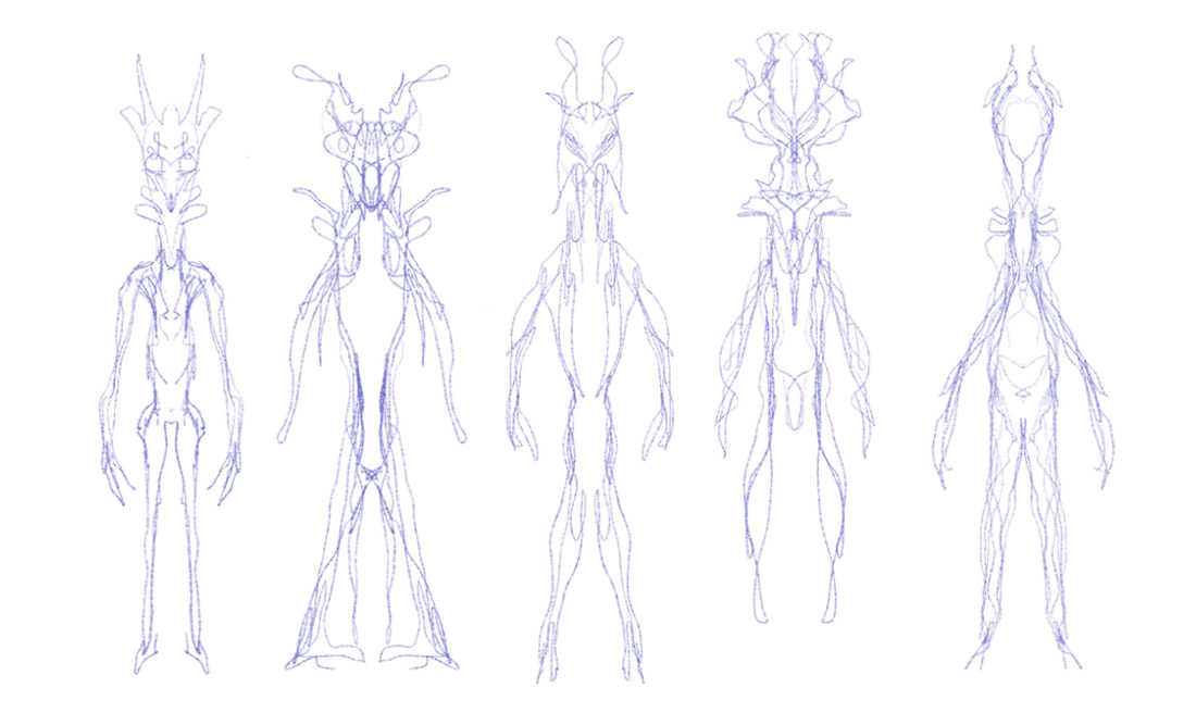
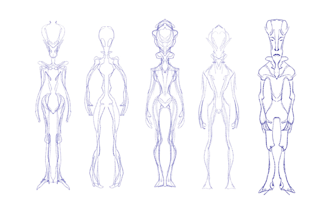
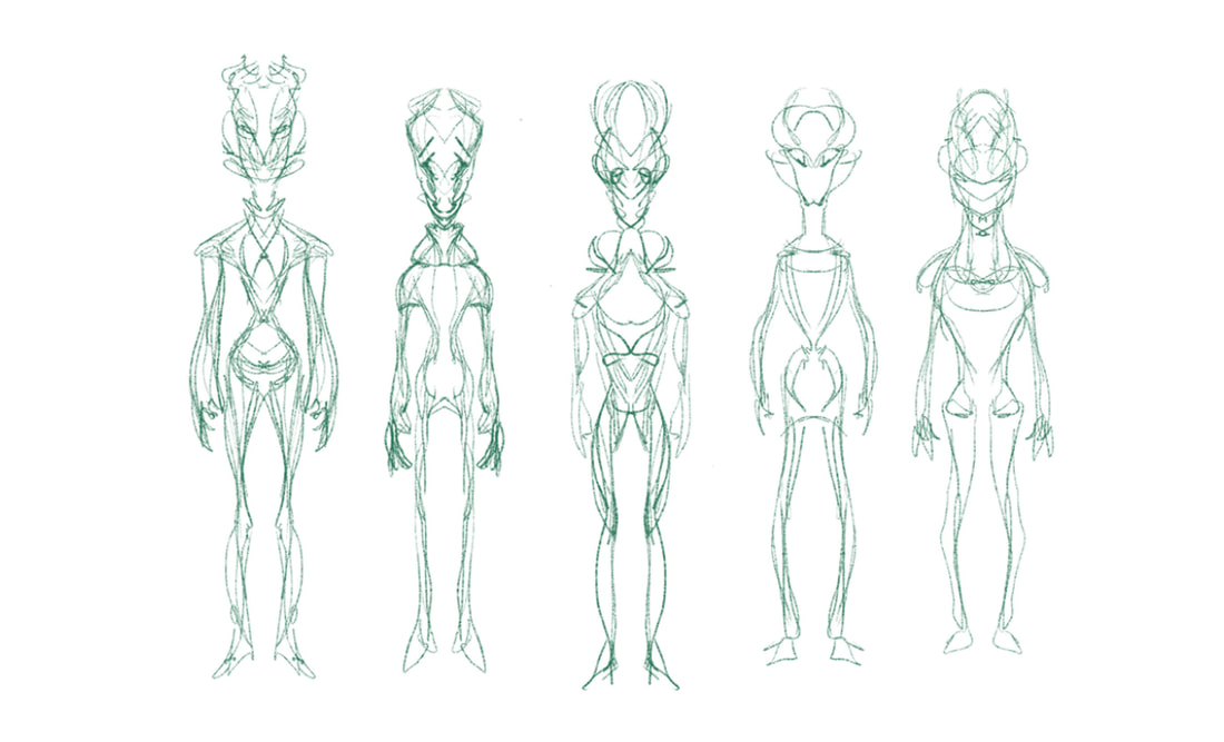
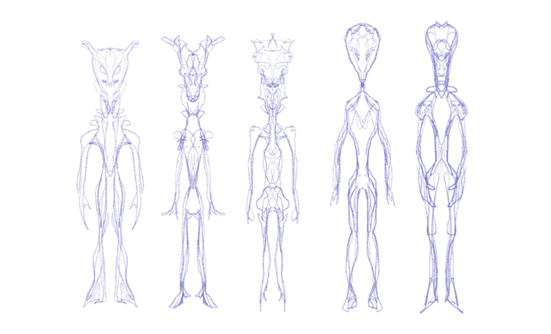
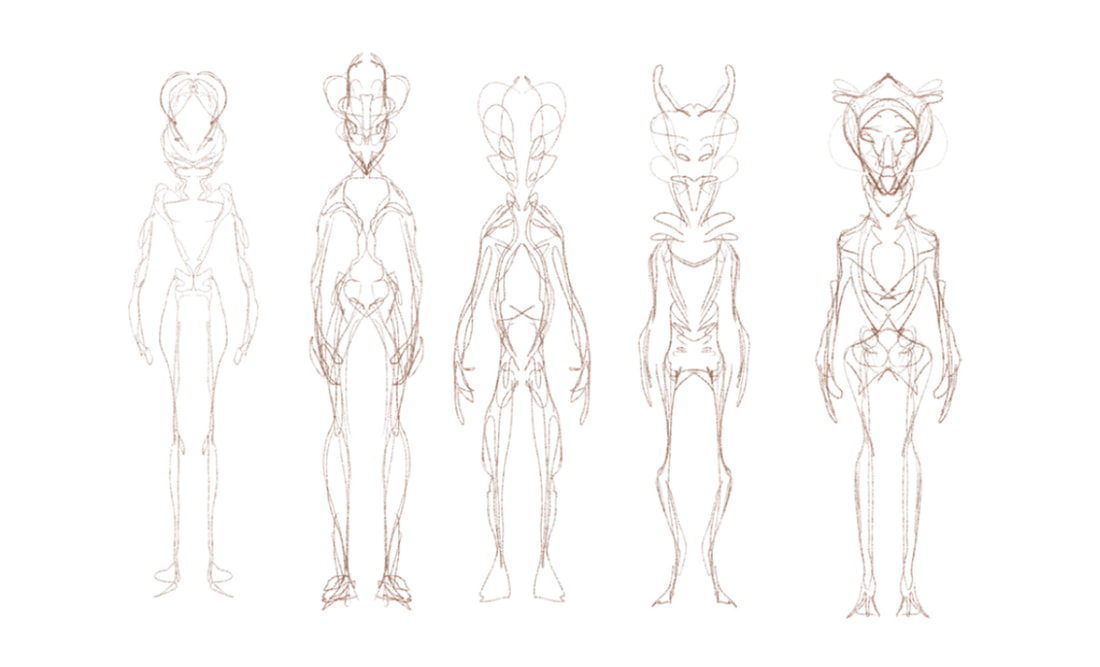
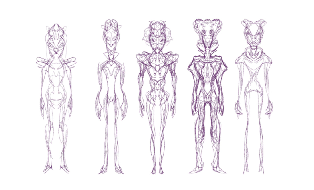
If you've looked through my portfolio, there is something you'll notice. I enjoy drawing cute things. Cute kids. Cute animals. If it makes you say "aweee", or "how sweet!" then I want to draw it. Working on a science fiction graphic novel doesn't necessarily fit into the "cute" category, which means I have to really go outside of my comfort zone for this project. Here you'll find evidence of my current struggles to draw something that fits into a science fiction movie. I am definitely down for the challenge. My buddy, Anastasios Gionis used to work with me as a character designer for The Rugrats. He currently works as a creature and character modeler for Blizzard. I think I need to study more of his work in order to get the feel of how to make something creepy and other worldly. I imagine he felt as comfortable drawing babies in diapers as I do drawing aliens. In my quest to deconstruct the method of drawing aliens, I came across a method which utilizes photo manipulation and the symmetry tool. I figured that if I used a sort of scribble method to draw humanistic type forms I might be able to come up with something unique. Using the "symmetry" tool in Clip Studio Paint allowed me to create a sort of strange doodle where I could create characters that I wouldn't normally think to create. Now, starting off, I knew that this particular alien was going to be tall, lean and extremely intelligent. As far as what it would look like, I had no idea. So once I drew these, I was able to start seeing faces and shapes that I could push into a direction and turn into something viable. The video below shows how I created the side and 3/4 turns on the final design I ended up creating. While working on the front view of the design, I had to be mindful of what the profile and 3/4 view of the character would also look like, which means I had to think in terms of 3 Dimensional form and space. I didn't think the body would protrude as much in the beginning but it started to take on an ant-like type abdomen. Cool! I never would have started out with that idea, but that's where I ended up.
So, one alien race down, and one more to go. The next alien race will be the opposite- short, squat, and not so bright. Should be fun!
2 Comments
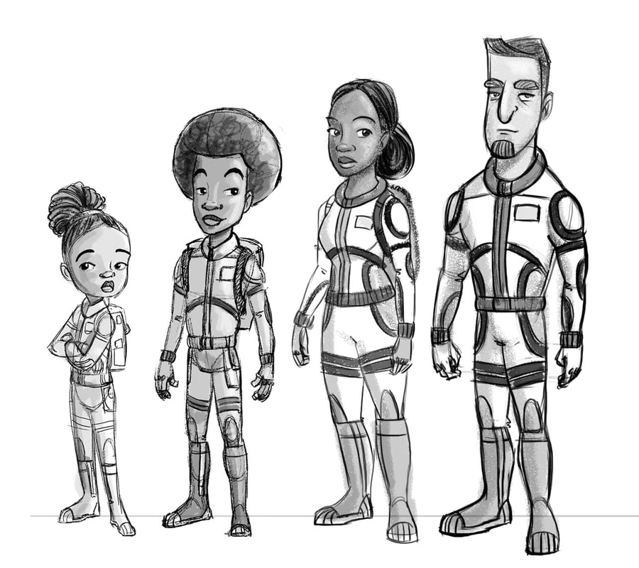
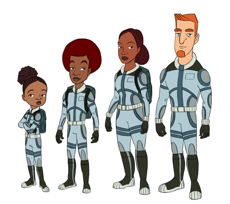
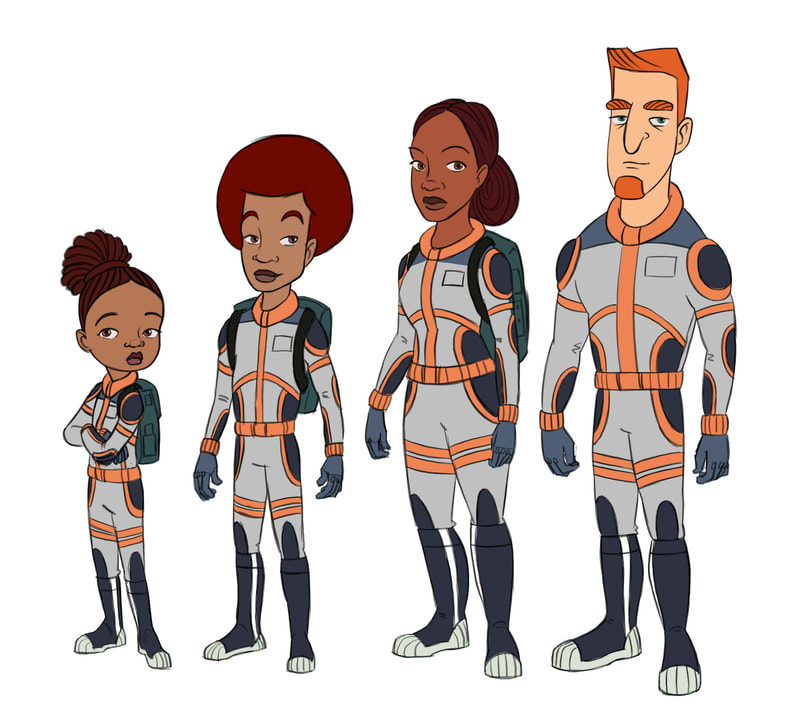
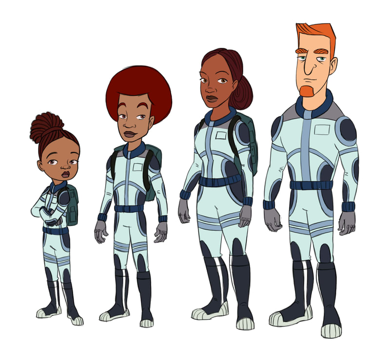
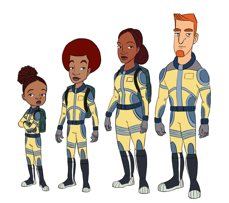
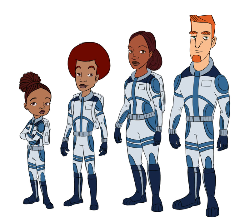
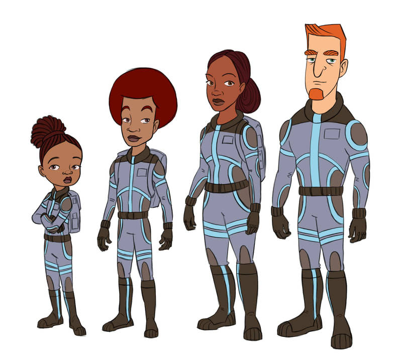
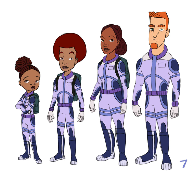
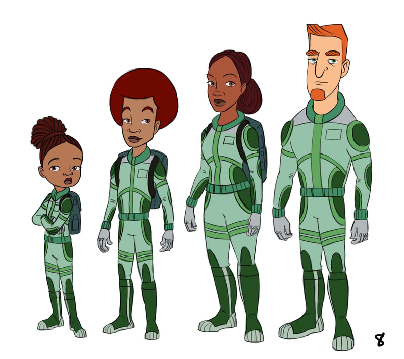
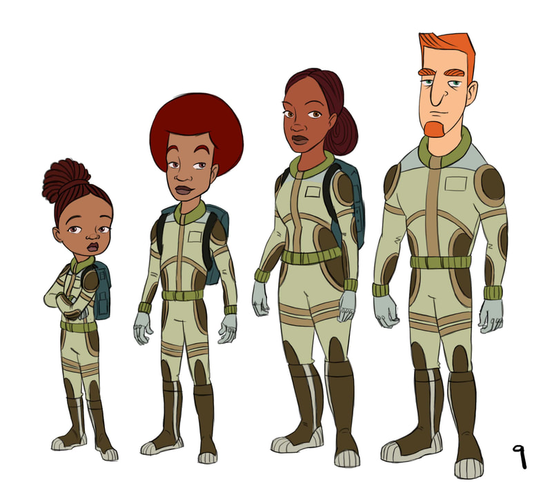
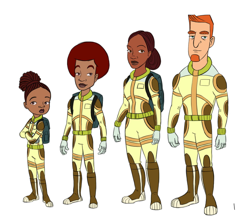
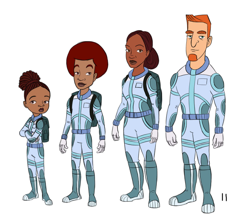
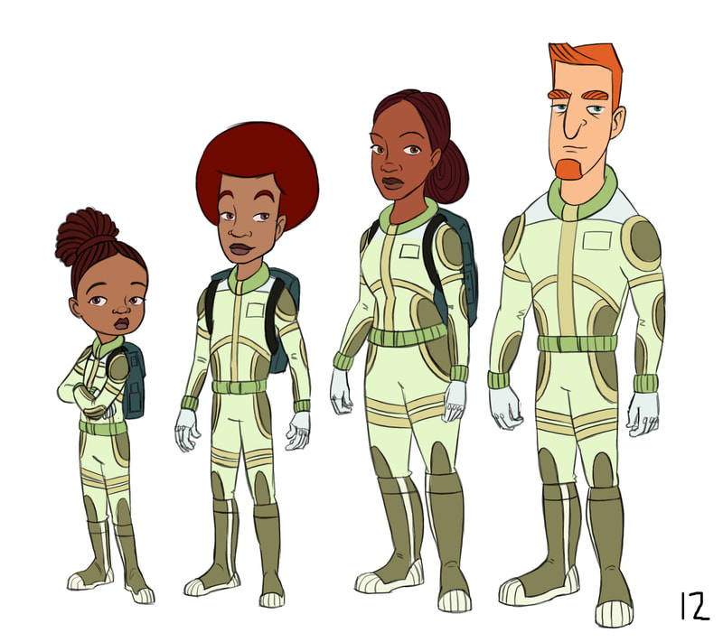
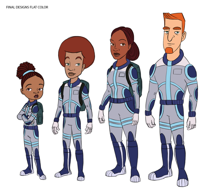
Blake Laser the graphic novel is about a bi-racial family. But this family is based on the way my own family looks, which really isn't bi-racial, it's more multi-racial. My mother was born in the Philippines. My father is African American. So, my sister and I could be considered biracial kids. In Blake Laser, the mother is Black and the father is of Irish descent. Years ago, I had seen a national geographic cover with a face on it that represented the next generation of mankind. The girl on the cover was olive skinned, with light colored wavy hair, facial features showing her African roots, but with light colored eyes. I thought it would be great if one of our characters looked like that. Once the sketches were done I did some color comps to play around with the outfits, keeping in mind that their outfits need to work with the colors I plan on using for the backgrounds. So, here they are. The family that I'll be living with for the next few months of my life while I develop this graphic novel pitch. Hopefully, an editor loves them enough that they become part of their family, too. I will then devote the next 18 months of my life to bringing their story into the world.
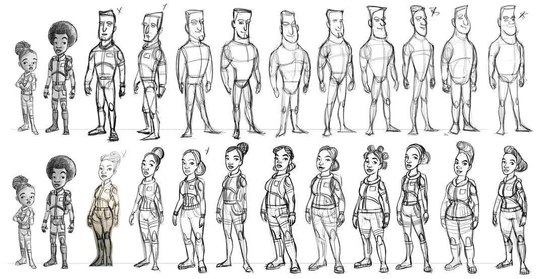
Every good family story needs to have some sort of annoying older brother, and Blake Laser has the perfect annoying older brother. Here are my rough exploratory sketches for him. Since I have already figured out my main character, all other character designs need to fit into her universe and have the same relative head to body proportions. So, when I designed this, I didn't have a size chart next to me, and I had to tweak the chosen drawing to fit along with my main character. The starred version is the one we chose, and the enlarged version is my attempt to resize him to fit proportionally with our main character. Even though I still tweaked him, once I see them side by side, I notice that his head mass is much smaller than his little sisters. Now that it's in Photoshop, I can tweak this up a bit and redraw it until I get him to look like the original sketch but also look like he lives in the same universe as our girl. Here I'm really liking the shapes I've got and I think he fits in nicely with his lil sis. I used oval construction lines to build his afro so I can redraw it easier next time on the panels. And here we have our final big brother! Approved by the author and happily accepted by the illustrator. Next up are Mom & Pops. Til next time.
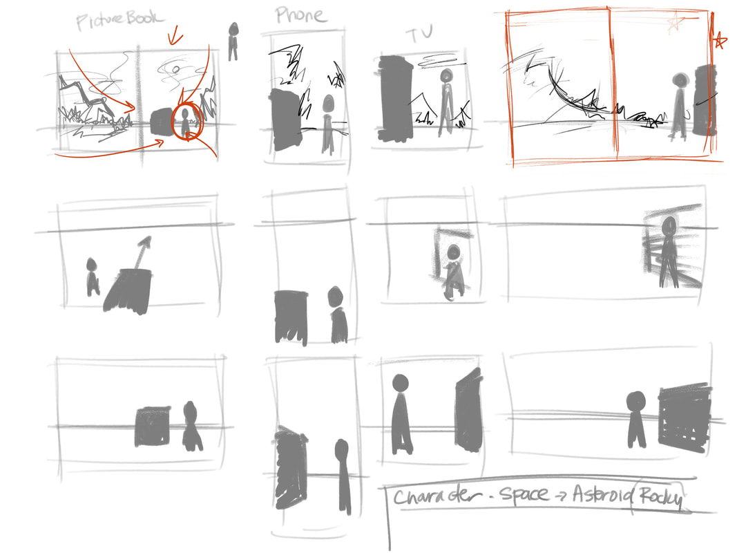
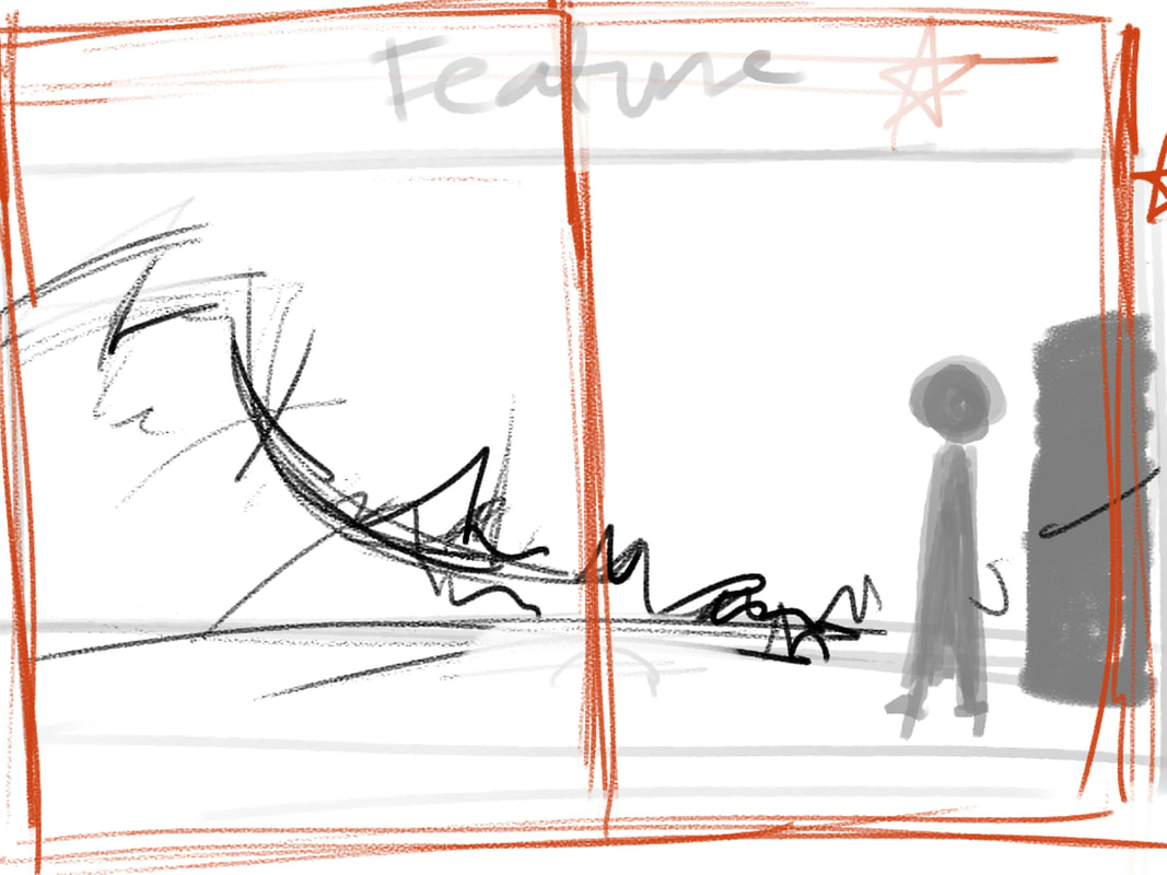
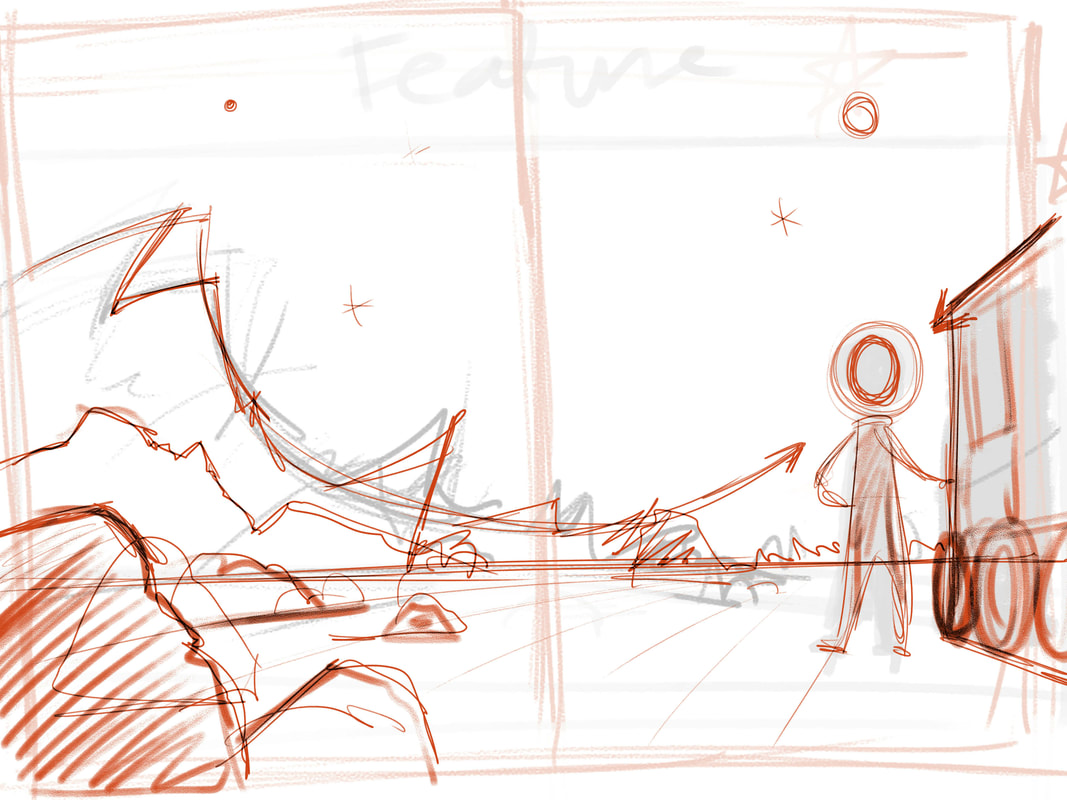
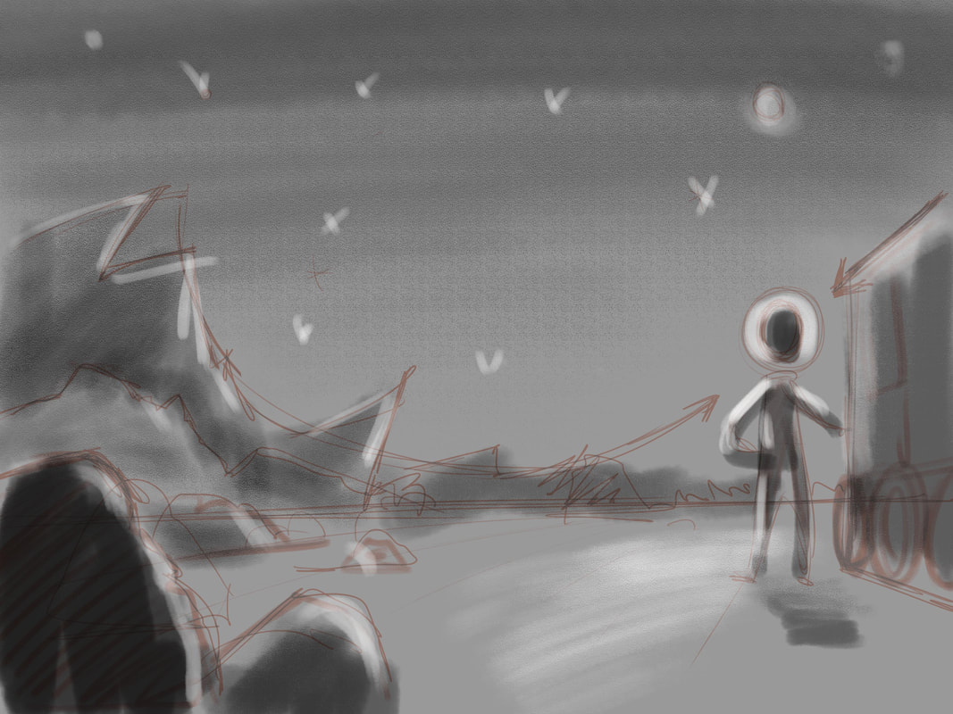
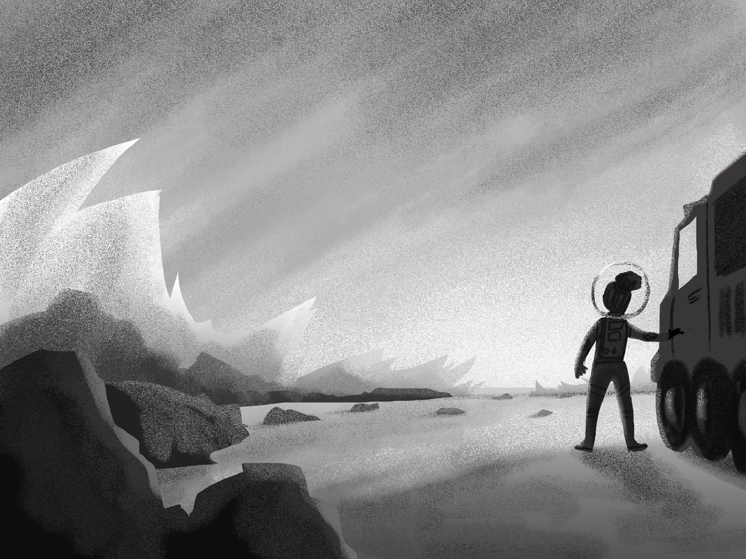
 Excited to begin the art for my graphic novel, I dove into some character sketches for my main protagonist, a biracial 12-year-old girl. Once I had sketched a few, I showed the co-author to get some feedback. His thoughts were along the lines of "be more edgy" which I then had to decipher the exact meaning of what "edgy" looks like. We went through some other graphic novels and researched the look of characters and discussed it further. "Like this style?" I'd ask. "No, that's horrible," he'd say. Okaaay. "How about like this?" I'd ask. "No, not quite like that." Back and forth it went until I pulled out an old sketch that I'd done and asked, "Like this?" BINGO! Yup! That's the visual that he needed to describe what his idea of "edgy" is. Now that I had something to visualize, I was able to make some changes to our main character. She went from the first drawing to the second drawing. Basically, smaller eyes, a little more angle to the face and a little more corners incorporated into the design. I'm pretty happy with her, and Keith likes her too. Actually, I love her. So, when I feel an emotional reaction to a drawing, I think it's a good sign. And with both of us now happy with our main protagonist, I started doing environment thumbnail sketches. I basically drew this out during my Digital Painting college class and explained the process of placing my horizon line in varying places and then plotting the character in the space first. By focusing on shapes first, I can think purely in design rather than get caught up with the details. I only really fleshed out the top row and would have done all of them but for the interest of not boring my students, I went ahead with the top image. I enlarged the thumbnail and then made sure it fit the ratio of a full page spread by adding space at the top and bottom of the image. Then I constructed the sketch a bit more to get some forms in and cleaned up the sketch a little, still trying to keep it rough. Lastly, I did a quick tonal value study over the comp. The one on the left I did very quickly in class and the one on the right I spent a bit more time with, using the lasso tool in PS to make some nice pointy hard shapes for the rocky mountains in the back and making sure I locked my layers on each element to keep the value gradation within my forms.
Well, that's all for now. Next up will be designing the secondary characters in the story along with fully developing the above illustration. Til next time!
|



 RSS Feed