|
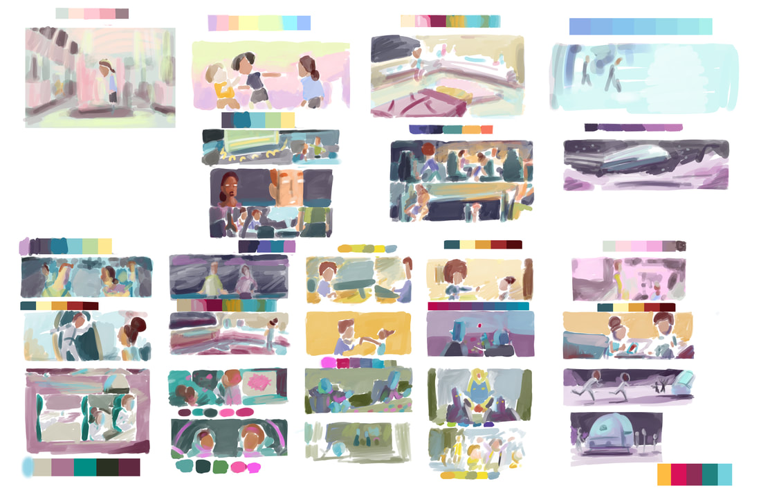
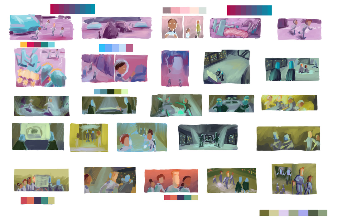
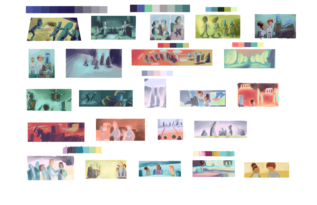
In my OC Art Studios Visual Storytelling Class with Caleb Cleveland, students develop the color scripts for a short story or comic. I took the opportunity to create my first color script for the graphic novel that I'm working on.
I knew that I wanted to have really dramatic lighting and some serious moody colors, so I had a fun time exploring color palettes and applying them to some pivotal emotional beats in the story. This Pixar in a Box Art of Lighting video is really helpful in explaining how lighting and color is used in a movie and can easily be utilized for creating the same look to your graphic novels. If you want to learn more about painting color and lighting, check out our online interactive course, or our Visual Storytelling course where you can do this very exercise for your own comic project.
0 Comments
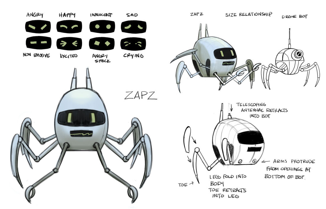
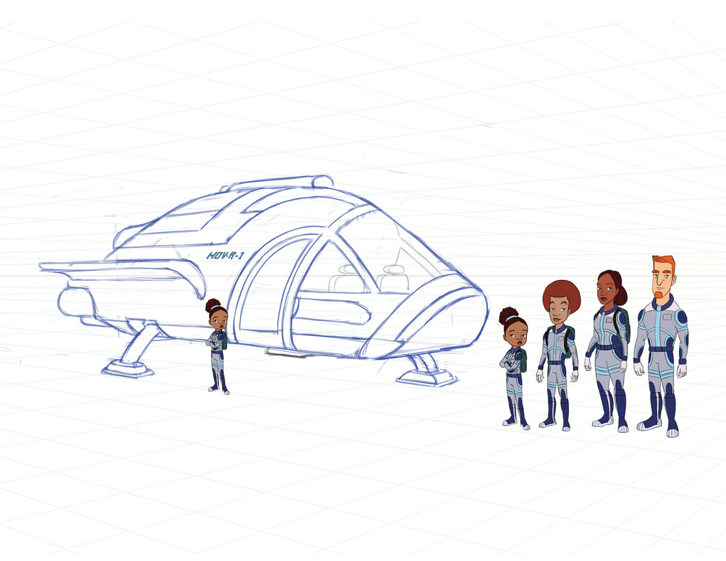
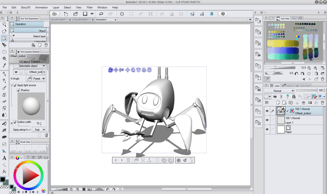
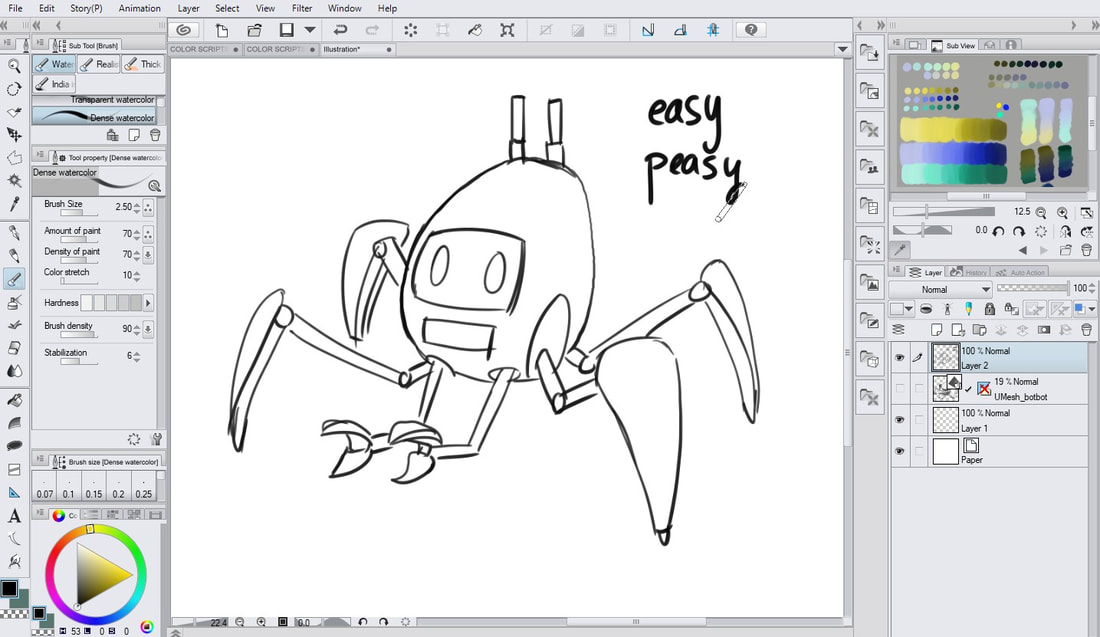
I don't know how to model anything in 3D so I hired a friend to sculpt my robot and my vehicle in Blender. Having a 3D sculpt of a vehicle is so handy for getting an accurate depiction from any angle. It's going to make my dynamic shots a lot easier to draw. Since I won't be struggling with drawing it from any angle, I won't be avoiding more difficult shots since I have a tool to help me position the vehicle from any point of view that I want. I started using Clip Studio Paint and I love that I can actually import the 3d objects and rotate them within the program. I can then lower the opacity and draw straight from the sculpt reference. Brilliant.
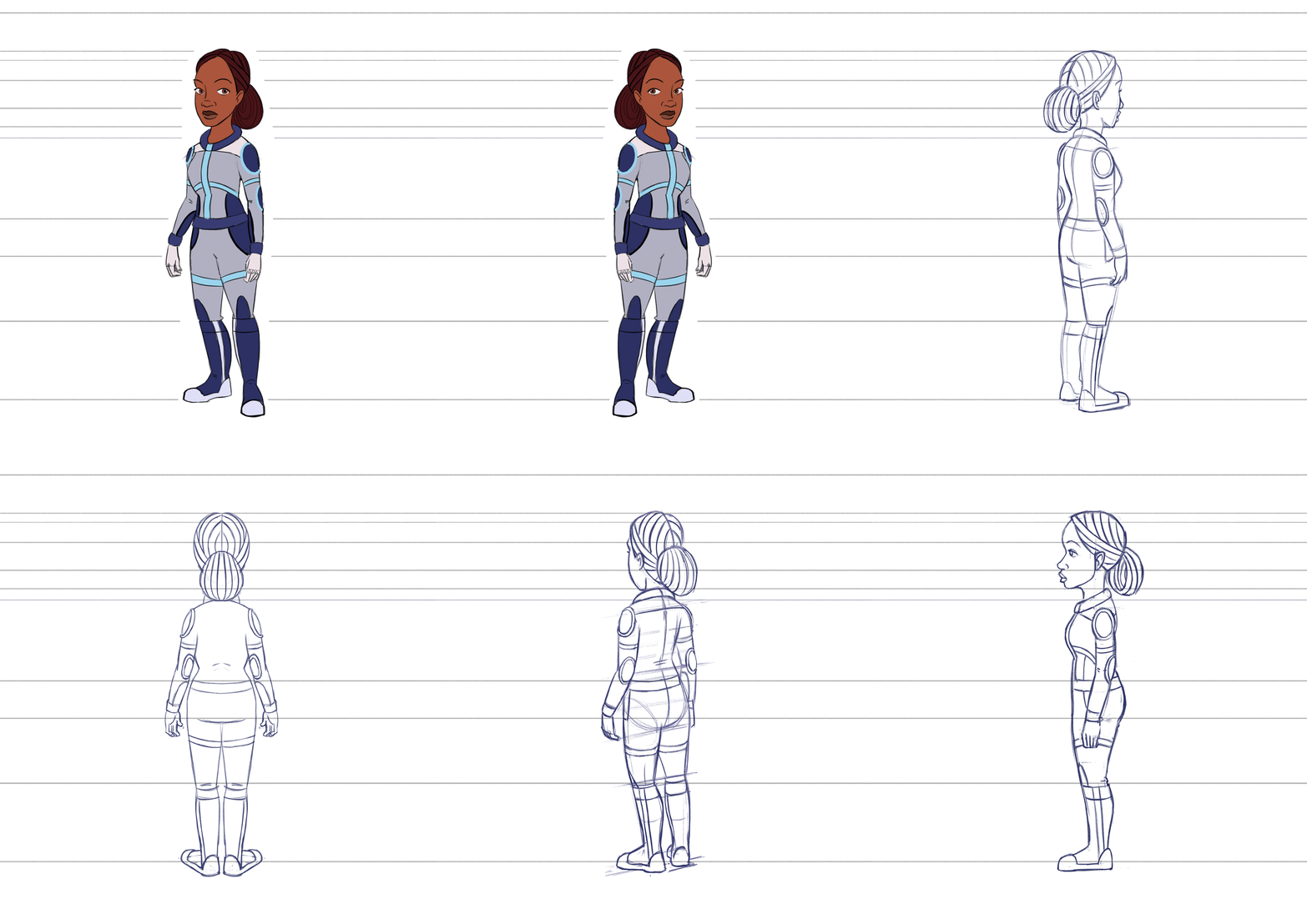
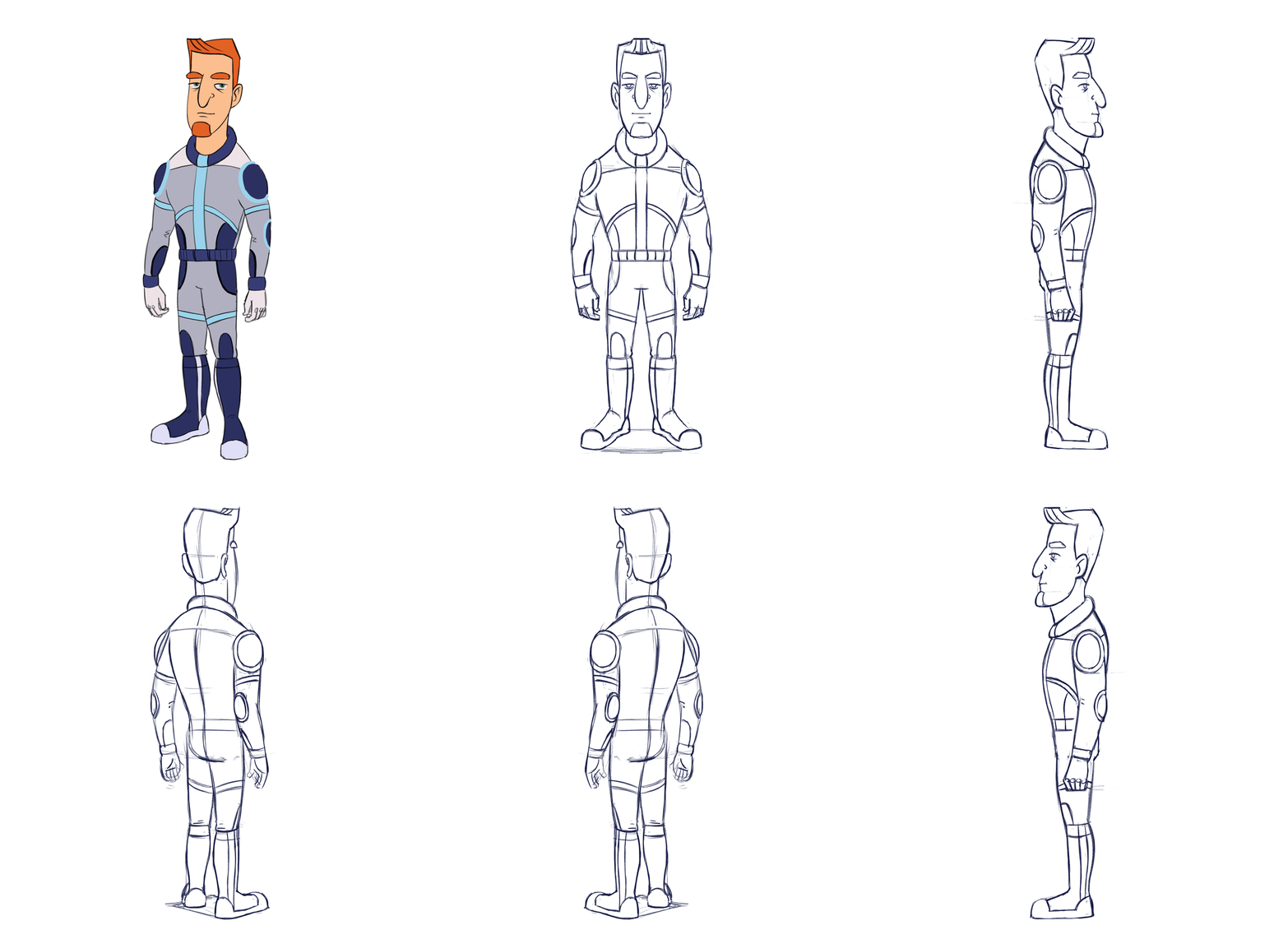
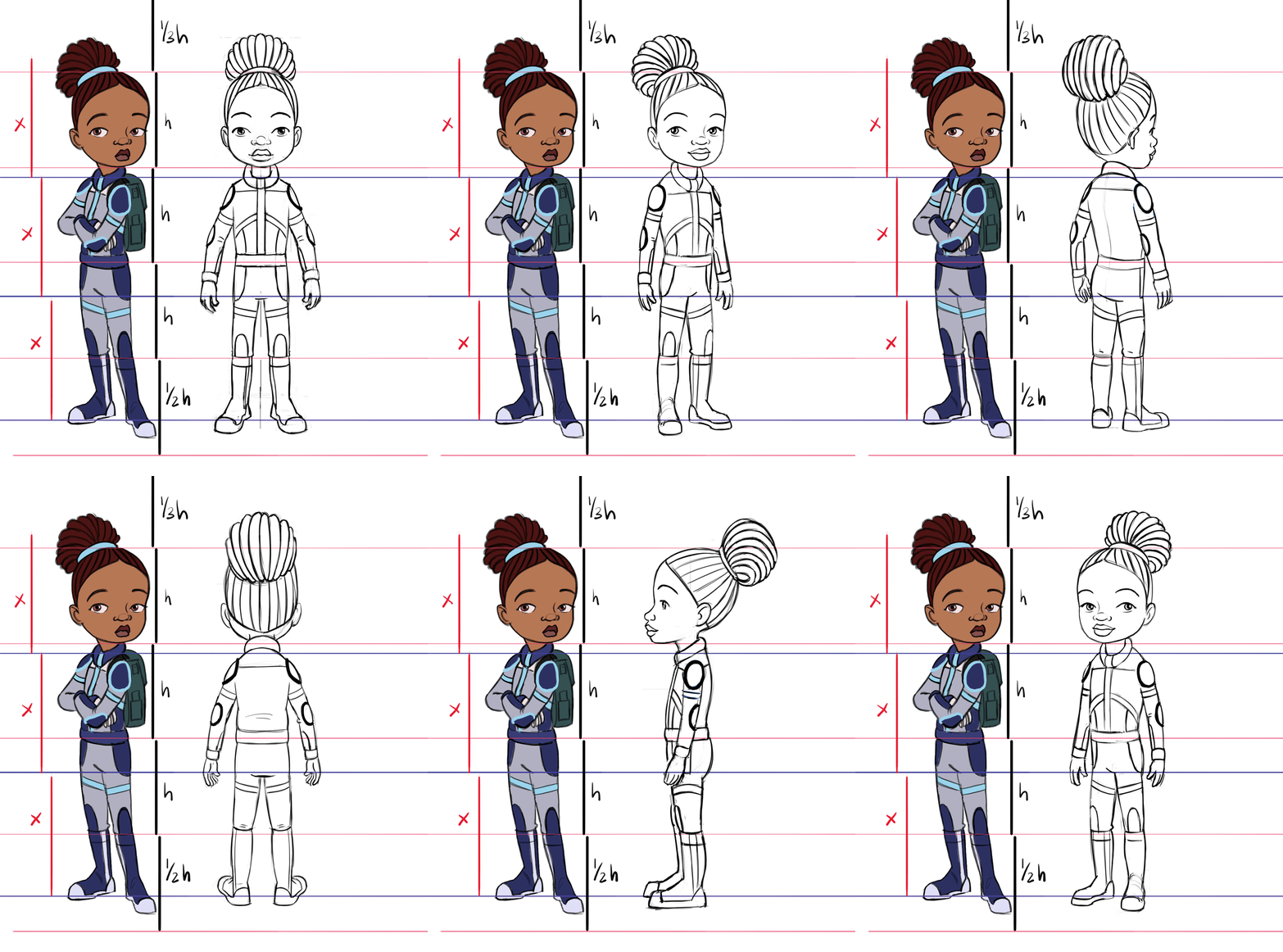
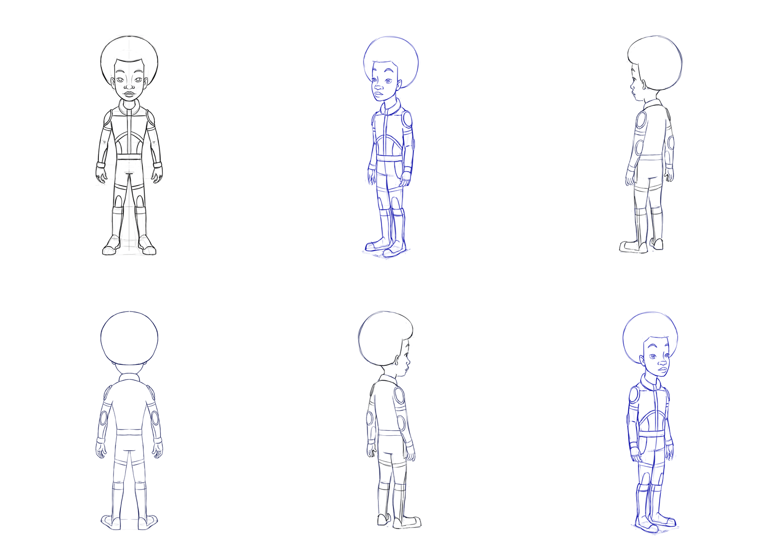
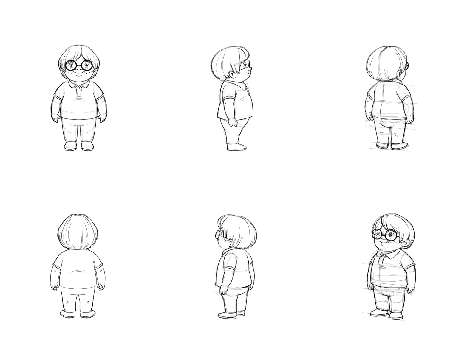
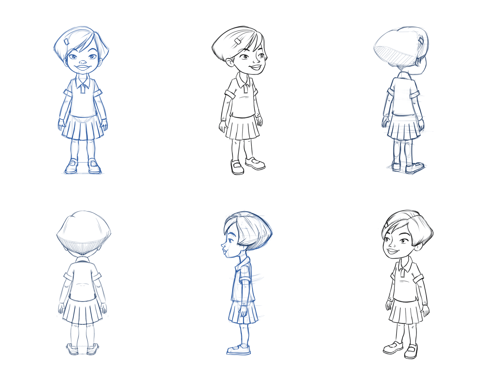
Knowing what your characters look like from the front, back, side and 3/4 views is going to help you draw your comic faster, especially if you're not designing it as you go. Nonetheless, I found myself moving on to the sketch phase without some of these turnaround designs and I had to imagine what these characters looked like from panel to panel. I also had to redesign my main characters after drawing them a hundred times and realizing that I much preferred the look of them the way I actually drew in my sketches when I compared it to the turnarounds I had originally designed. Below you'll see the animated turnarounds I did to ensure consistency in the views. The bits that gave me the most trouble were the ponytails and hair. I didn't bother to color them all in because I used this as a tool to make sure the drawings are accurate. If you are working on a graphic novel or a picture book, it really is helpful to have a turnaround sheet for your characters drawn up before you begin sketching your story. It'll help save you time and frustration in the long run. Also, if you're not sure how to do this and are interested in learning, consider signing up for my Character Design course in the future! I do notice that the leg stripes are popping a bit in the turnaround here. If I had the time, I'd go back and tweak that. But I've got lots more things to design, so this will do for now. 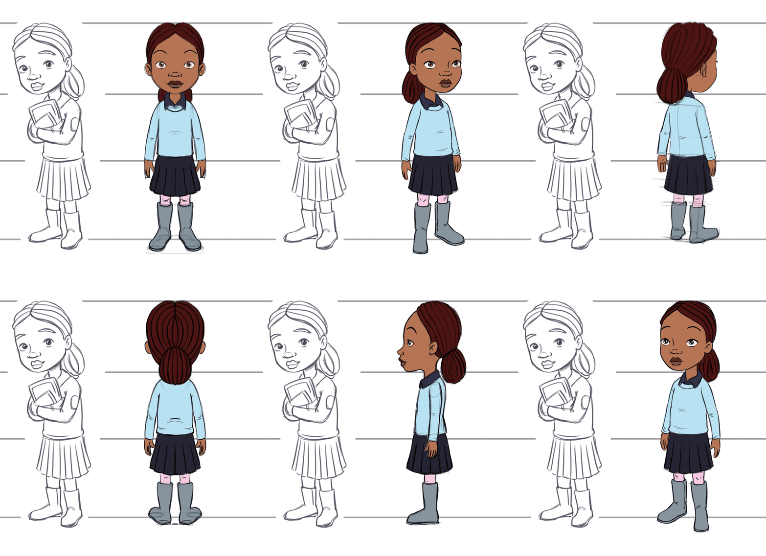 |
 RSS Feed